Joy Cheung - Community Post
2022

2022
Clients: Cheung Sah Wan Community
Category
Project Description
Branding
Logo, Colors, Icons, Typography, Brand identity
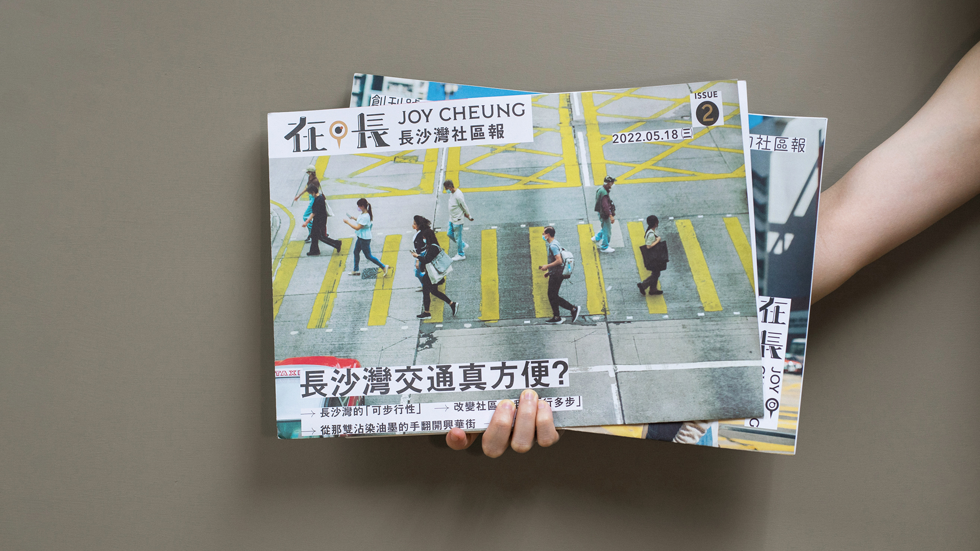
"Joy Cheung" is a community newspaper for Cheung Sha Wan, compiled, interviewed, filmed, published, and managed independently by residents on an online platform.
The Discovery
Individuals may hold diverse perspectives and perceptions of the same neighborhood, even after residing there for years. While some may associate sand color with Cheung Sha Wan, others may not share this view. Therefore, prior to establishing the brand image for the district's community newspaper, we engaged in discussions with residents to ensure that the design resonated with the majority and effectively facilitated community communication.
Solution
The brand identity of the newspaper incorporates elements from the environment, characteristics, architecture, and historical background of the Cheung Sha Wan district, hence the logo, typography, and color scheme all have an industrial feel. The goal is to distribute the newspaper to connect the community with its people and events, and to foster a spirit of mutual assistance among neighbors.


Thank you for watching!

